Foam Fun Letters Font Improved!
We asked a panel of early literacy experts to review our Foam Fun letters. With their input, we made some great improvements, creating a more modern, basic, and consistent font that makes learning letters shapes easier for early learners. Here are a few examples of the beneficial changes:
- Each letter now has a uniform stroke width for added durability.
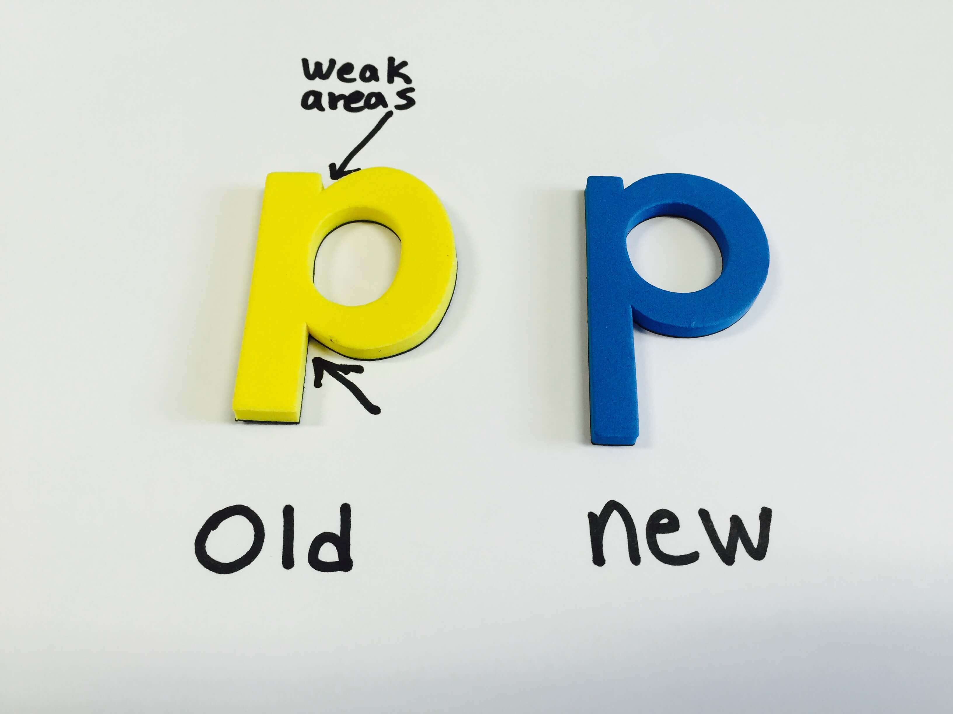
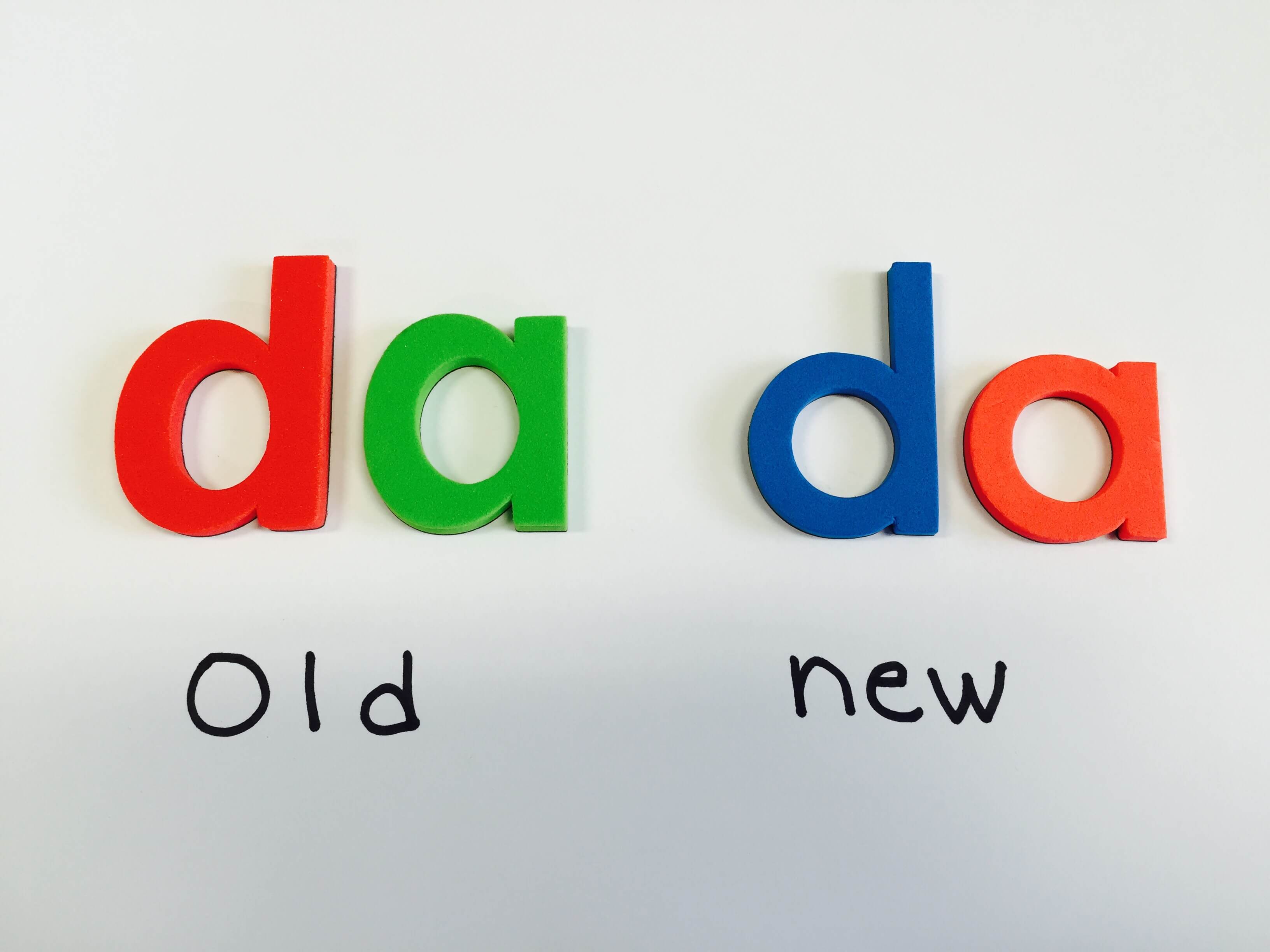
- The heads and tails of letters were extended proportionally to make it easier for children to distinguish certain letters from one another. For example, the head of the “d” is now taller, making it more obvious that it is not an “a.”
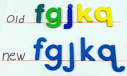
- Some letter shapes were improved to better match commonly used early learning fonts.
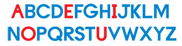
- In the red and blue Foam Fun letter sets, “y” and “w” are now included in both red (vowel) and blue (consonant) colors since these letters also can be vowels (diphthongs: “ew,” “ow,” ” ay,” “oy,” and more).
What hasn’t changed? They are still FUN! For ideas on how to use these great magnets, read our blog about literacy games or check out all our Foam Fun letter sets.
Tags: foam fun magnet letters
Share This: